

So, the task for the second week came in on Monday 13th July. The task at first looked very easy, the team had a meeting and we agreed to work with Malaria and Cholera datasets, duties were assigned to get the datasets rolling latest Tuesday evening so work can start as soon as possible.
Below is a visual of the task:
We were able to scrap some data from Kaggle.com, NCDC website, WHO website but we couldn't get the information we need from the data. A team member was able to scrap 2 datasets from Kaggle.com on Malaria and Cholera respectively. The team had a meeting were the datasets were discussed and we napped out how to work with the dataset. Cleaning up the dataset was quite challenging.
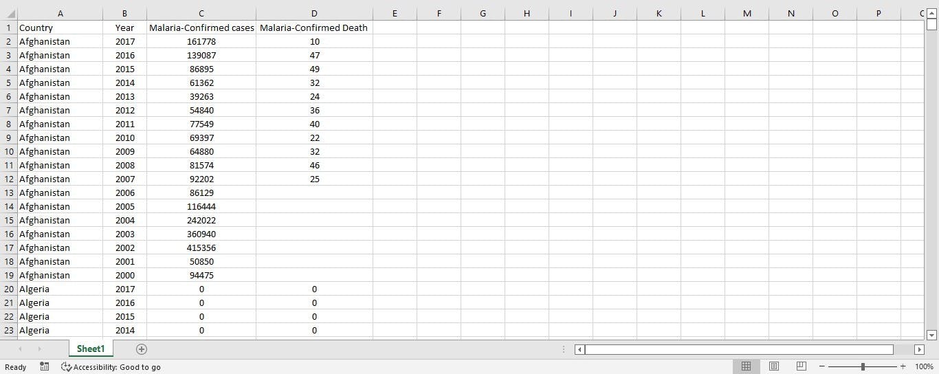
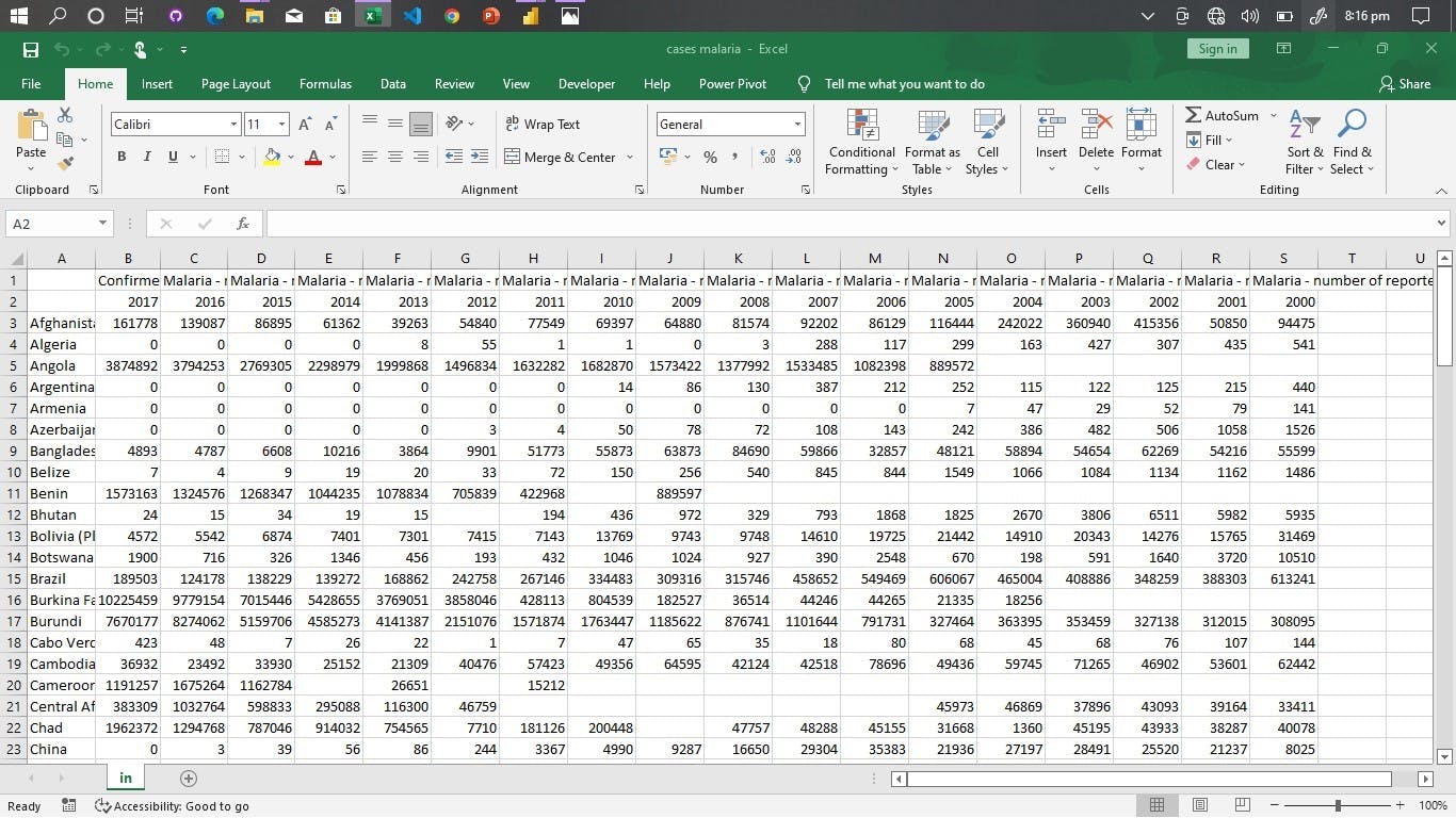 Malaria Cases Dataset
 Malaria Deaths Dataset
The rows and columns were arranged in a quite confusing way, the team had to arrange the data to the right format. We merged the Cholera dataset to the Malaria dataset using Microsoft Excel, where we did some filtering and calculations like the mortality rate.
See visuals below:
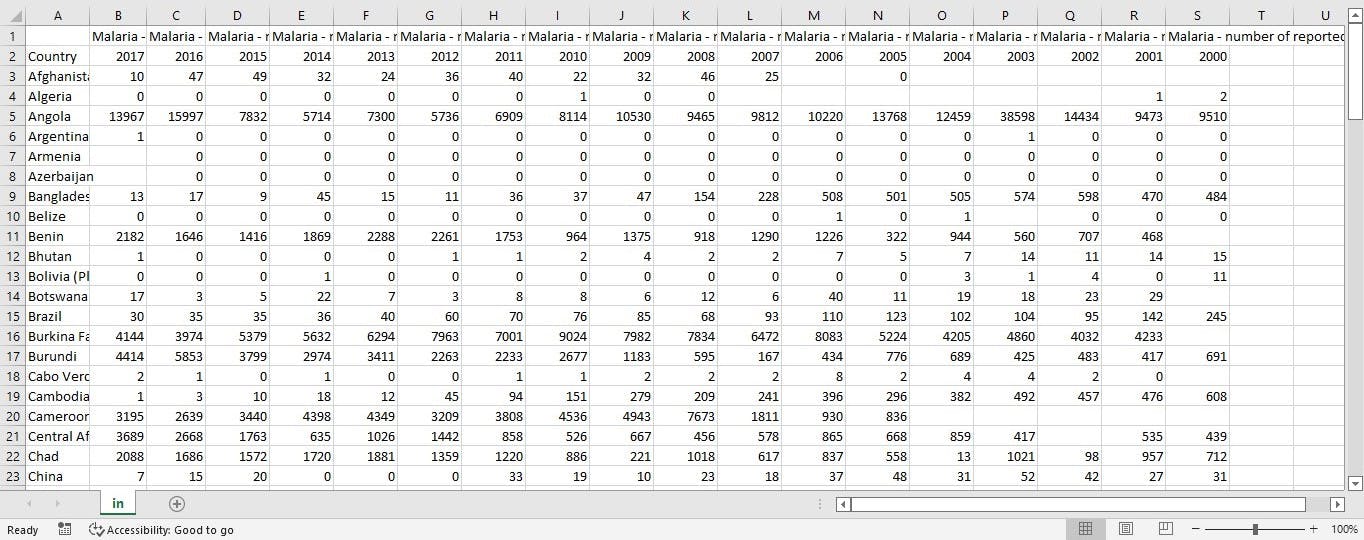
 The cleaned Dataset
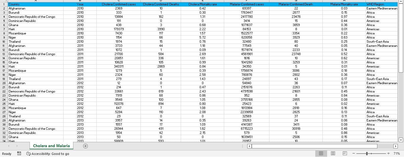 Merged and Cleaned Dataset
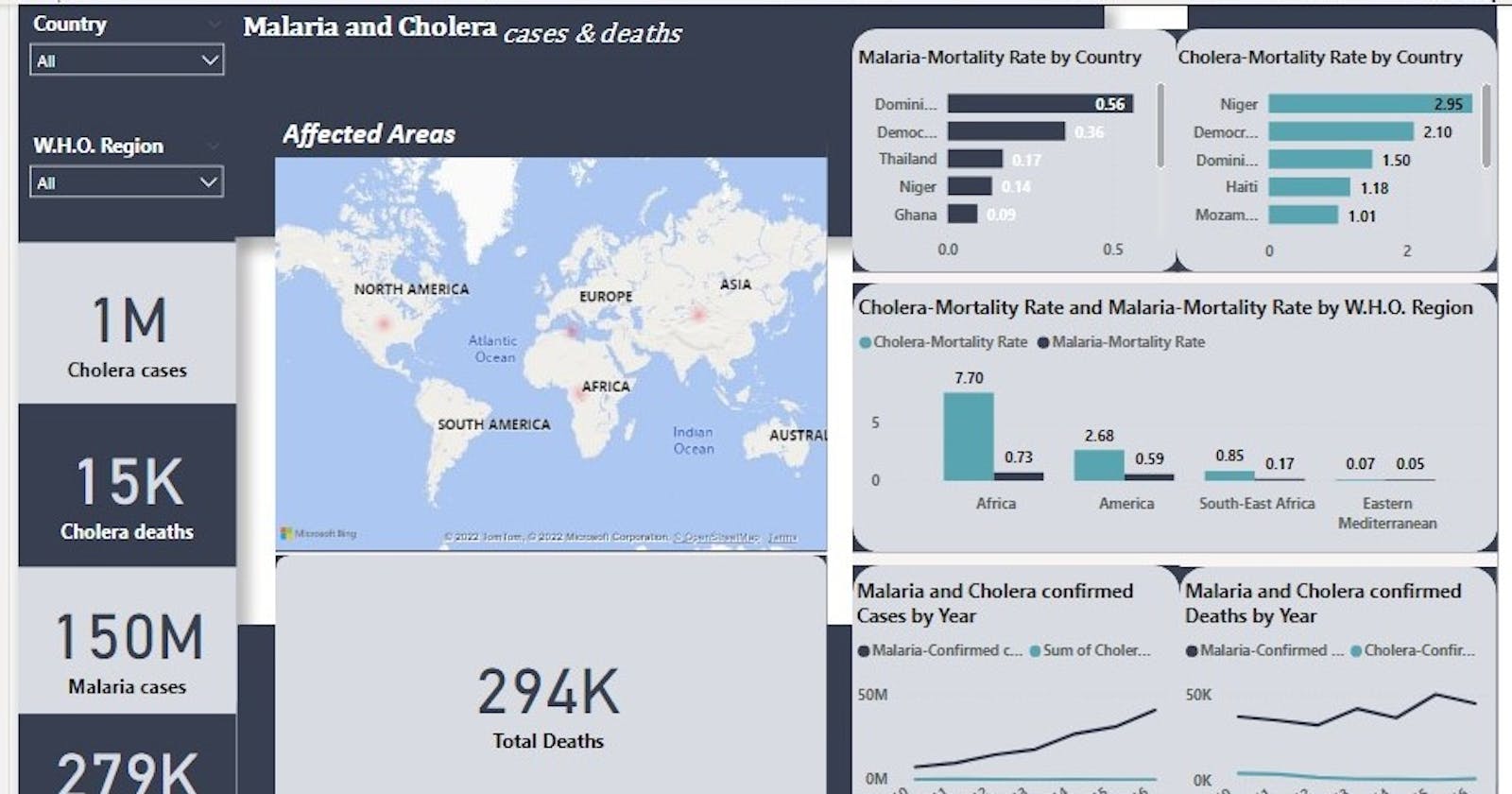
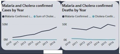
Now we moved to Visualisation using Power BI. We visualised the cases and deaths recorded (Cholera & Malaria) for each year using a line graph.
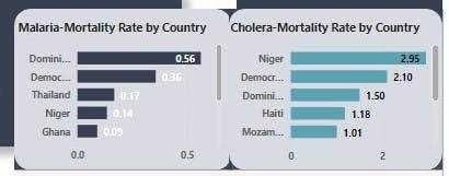
We then visualised the mortality rate (Malaria & Cholera) by country using the stacked bar chart.
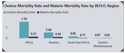
After which we visualised the mortality rate (Malaria & Cholera) by WHO Region using the Clustered column chart.
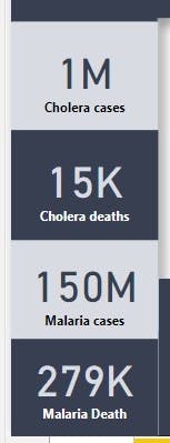
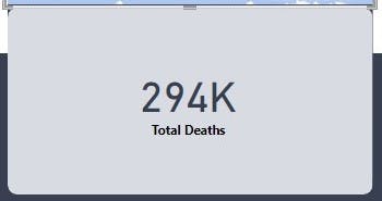
The total cases and death of both diseases were then visualised using the Card.
The total death recorded is 294 thousand.
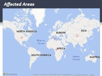
We then visualised the affected areas on the heat map.
We were able to complete the task for the week though we couldn't get a data that answers all the questions in the week's task. The team is presently looking forward to next week's task.
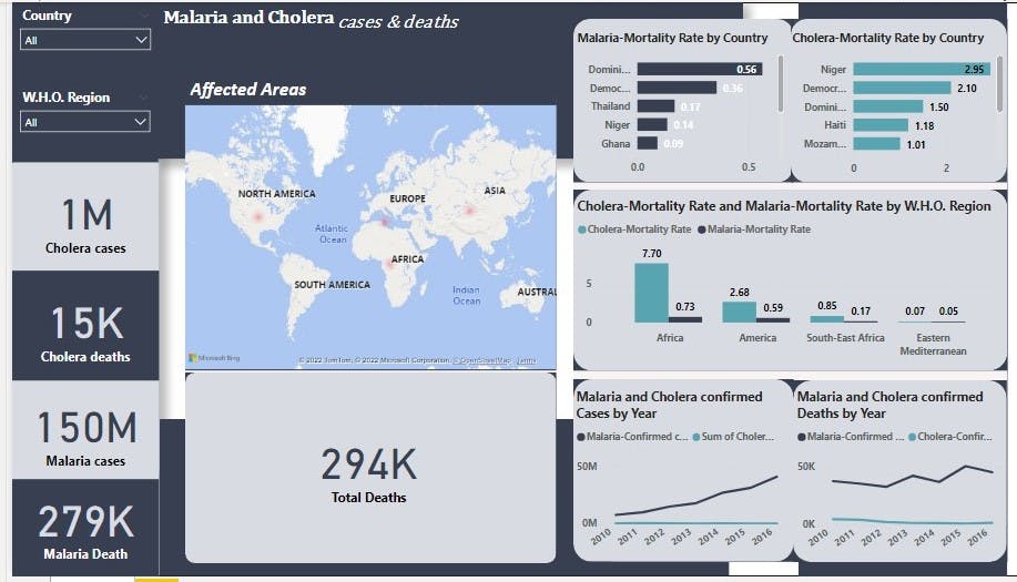 The Dashboard
In case you missed our last week's hashnode documentation Click Here