

Background
This is the third week of the Side Hustle bootcamp and I must say its been an amazing journey so far. The team members; DAteam12 have been able to get hands on project to further fine tune our skill and we must say we have improved. This week's task is for us to work on on the Football World Cup Analysis using data from 1930 till present, we are to Scrap, clean and visualize the data using Power BI. This analysis was carried out to find out how Countries have participated and performed in the FIFA World Cup, draw insights from the visuals from the analysis.
Data Collection
The team scrapped some data and we eventually agreed to work with the dataset from Kaggle.
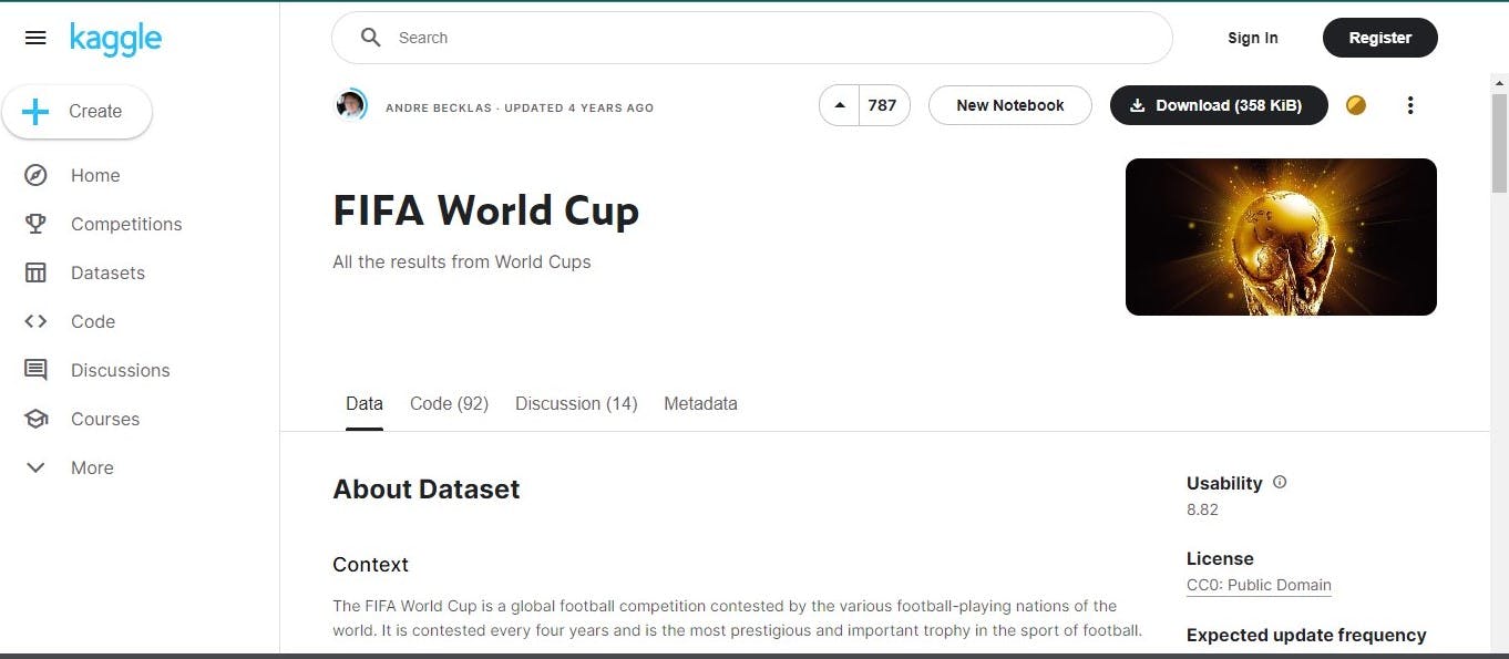
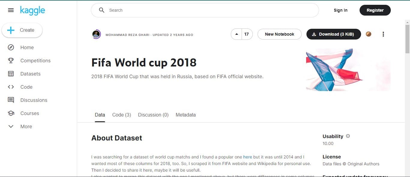
The data we scrapped had information of the World cup from 1930-2014, this prompted us to scrap another dataset to get a full grasp of the information for World cup 2018 which had in it a dataset which has the information of the winners of the world cup from 1930-2018. This data was also scrapped from Kaggle.
Upon scrapping the data the whole team got working on it.
Data Preparation
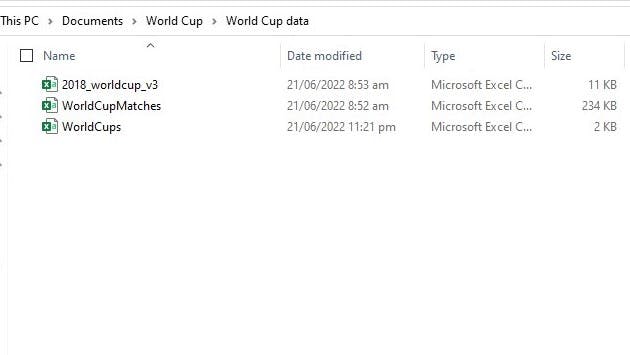
A folder was created where the datasets we are working with were kept, this was done for the sake of easy navigation and accessibility.
After this we had a brief overview of the data in Microsoft Excel.
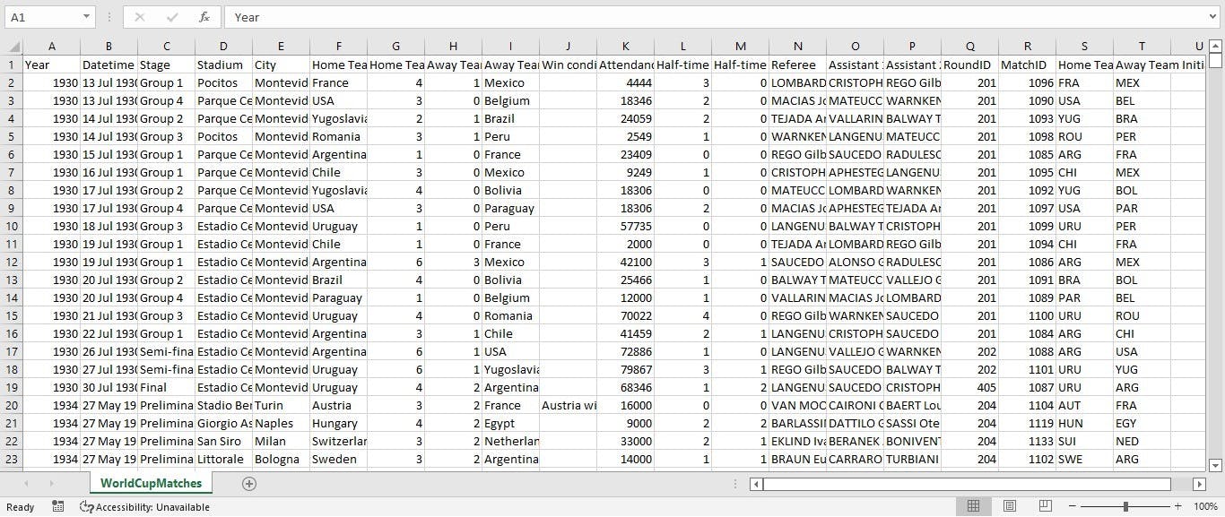
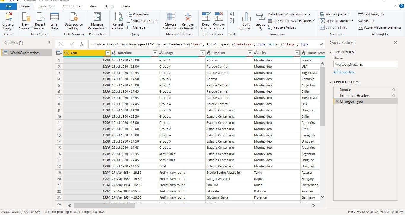
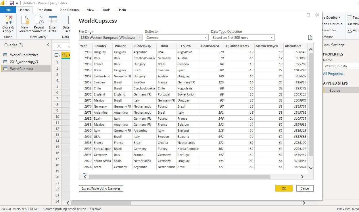
This data shows an information of the World Cup from 1930-2014.
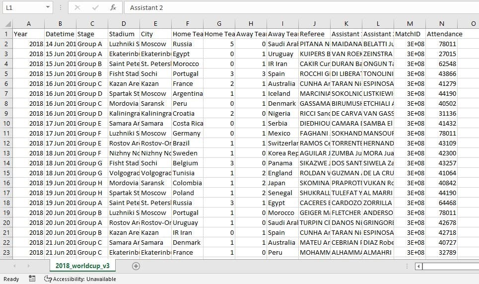
This data shows an information of the World Cup for 2018.
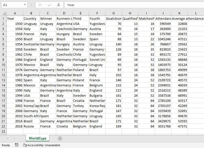
This data shows an information of the World Cup from 1930-2018.
Upon doing this we went ahead to open up the Power BI desktop where we will carry out some analysis and visualizations. The following are the steps we followed to get the data and carry out some analysis:
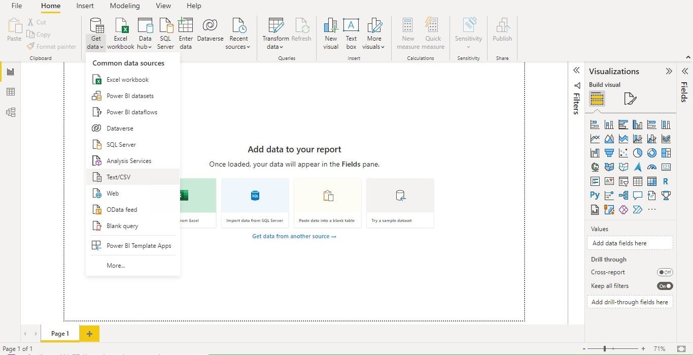
- the first thing we did was to use the Get data function on the Home tab of Power BI
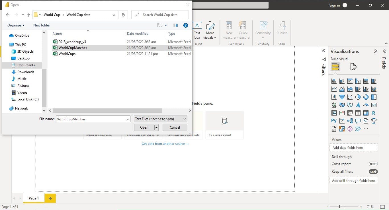
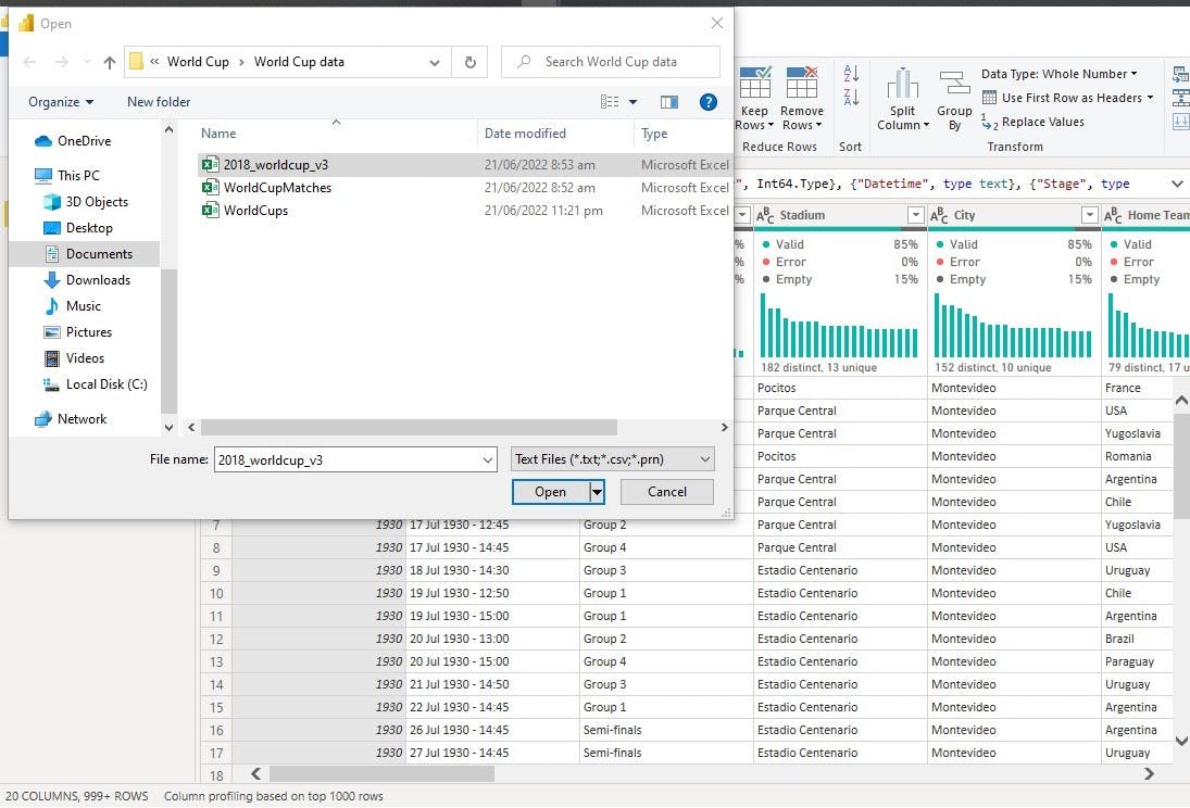
The data we are working with are CSV (Comma-separated values), so we clicked on Text/CSV and navigated to the World Cup data folder which we created in which we kept the datasets we are using. We simply clicked on the dataset we are working with and clicked Open.
- after this the Navigation page opens where there are options like Load, Transform Data, Cancel. It is advisable to click on Transform Data so as to carry out some cleaning of the data before loading it to Power BI. By clicking on Transform Data it opens up the Power Query Editor where we cleaned the data.
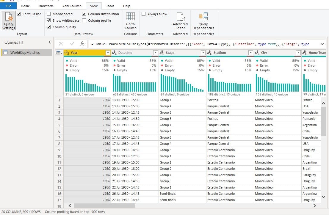
The Power Query Editor may open up without the distribution information of this data like the visual above, you may want to turn it on by clicking on the view tab and mark Column distribution and Column Quality as seen below.
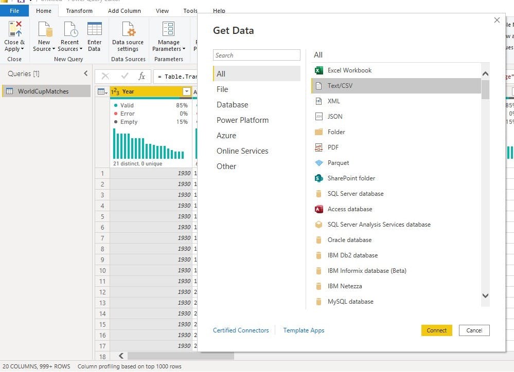
- the next step we followed was to import the 2018 dataset which is also a CSV file from the Power Query Editor. We simply clicked on New Source on the Home Tab of the Power Query editor we then selected Text/CSV and clicked Connect.
From here we navigated to the folder we kept the datasets we are working with. In the folder we selected the 2018 dataset and clicked Open.
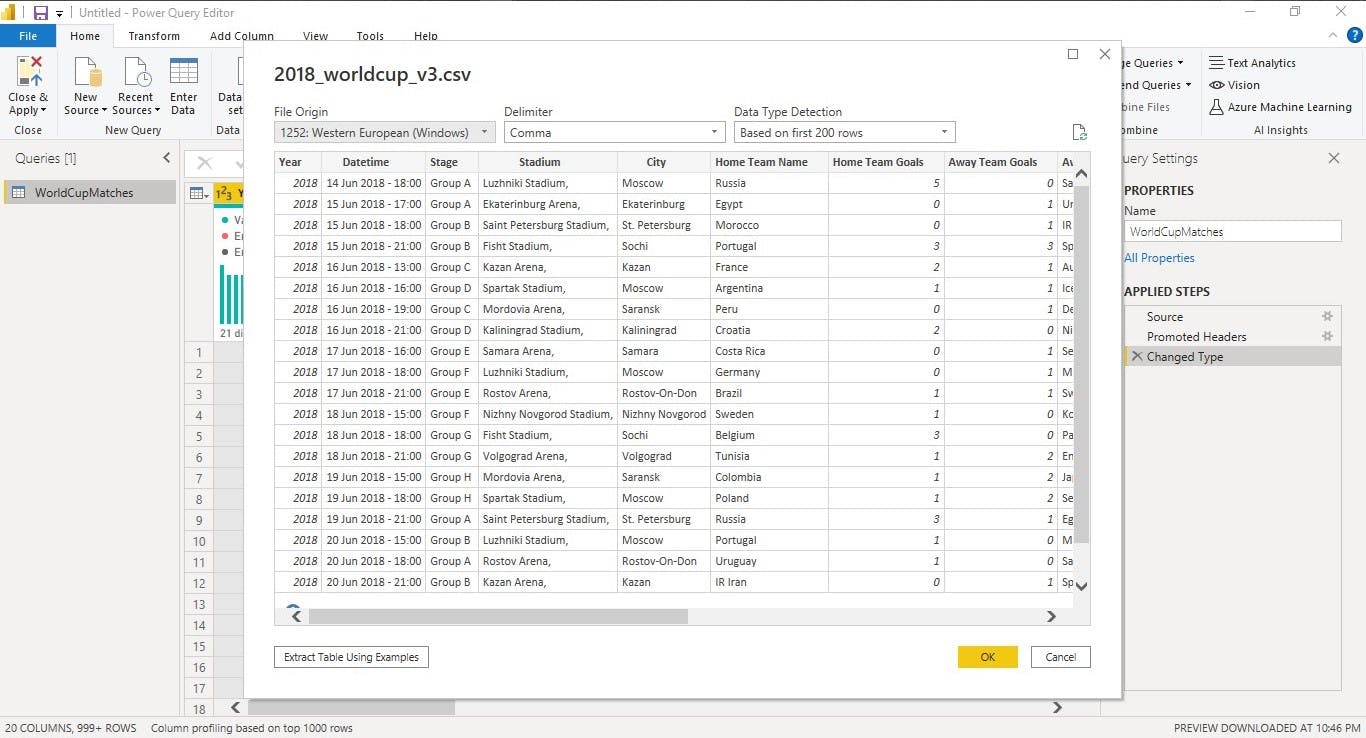
The dataset preview pops up where we selected Ok to load the data to the Power Query Editor.
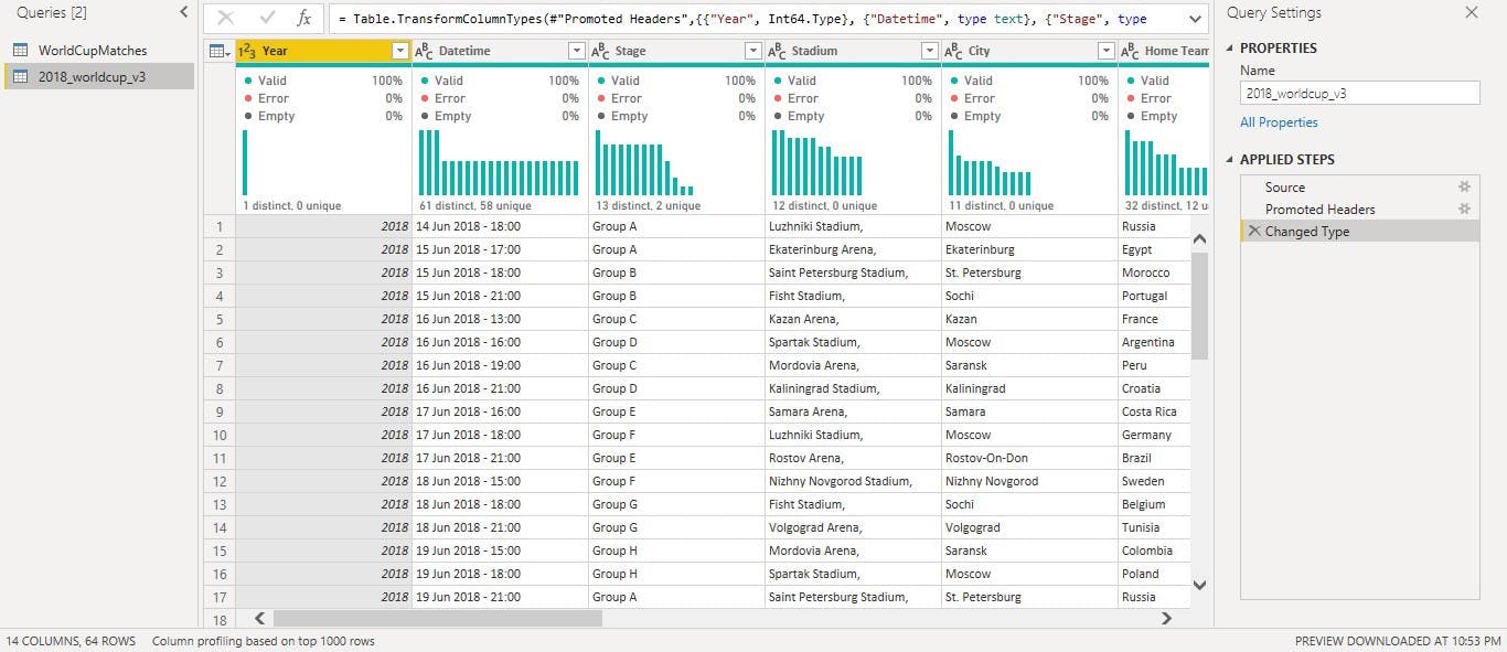
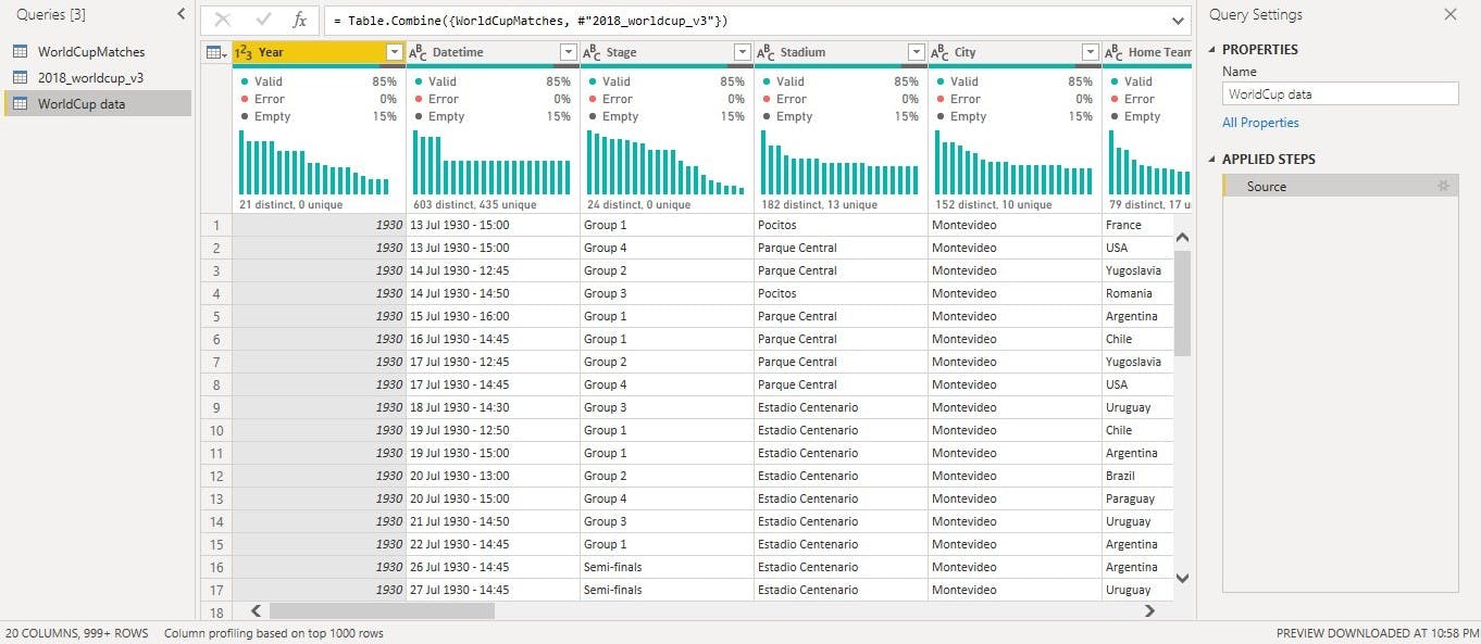
Now we have the two datasets in the Power Query Editor.
- to work on this datasets we Appended the two Queried using the Append as new function on the Home Tab of the Query Editor.
We clicked on the two datasets we'd like to Append and clicked okay.
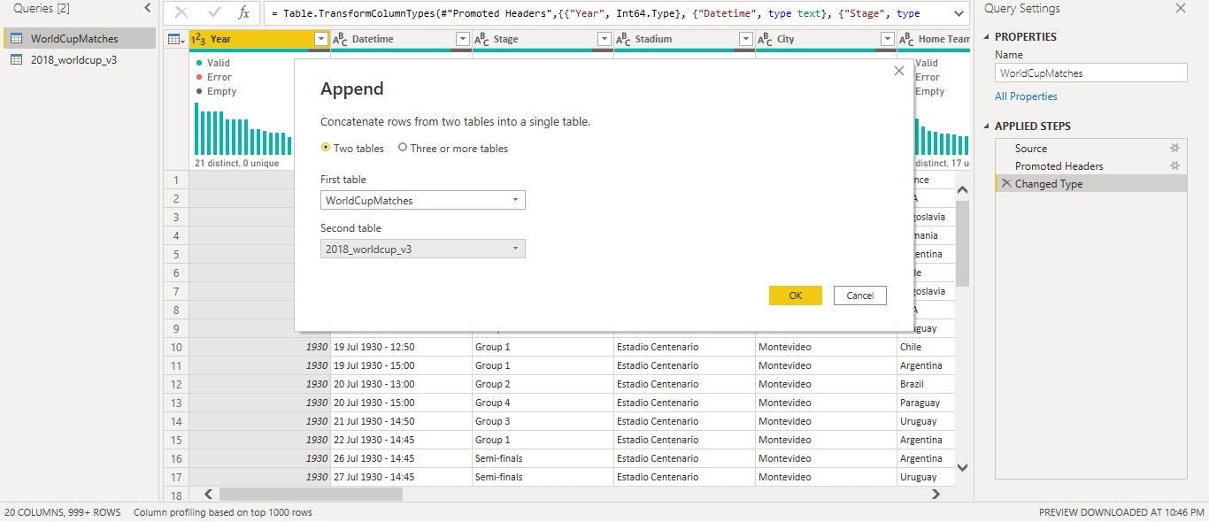
note: the Append function is used when trying to combine different rows while Merge is used when trying to combine Columns which is why we used the Append function.
- we renamed the Appended datasets to WorldCup data.
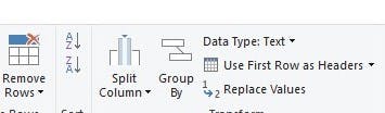
- at this point we went ahead to clean the data by removing the columns not needed for the analysis like the Home team initials, Away team initials, Winning condition etc. We did this by holding down the control button and clicking on the Columns we want to delete, after which we right click and selected Remove Columns.
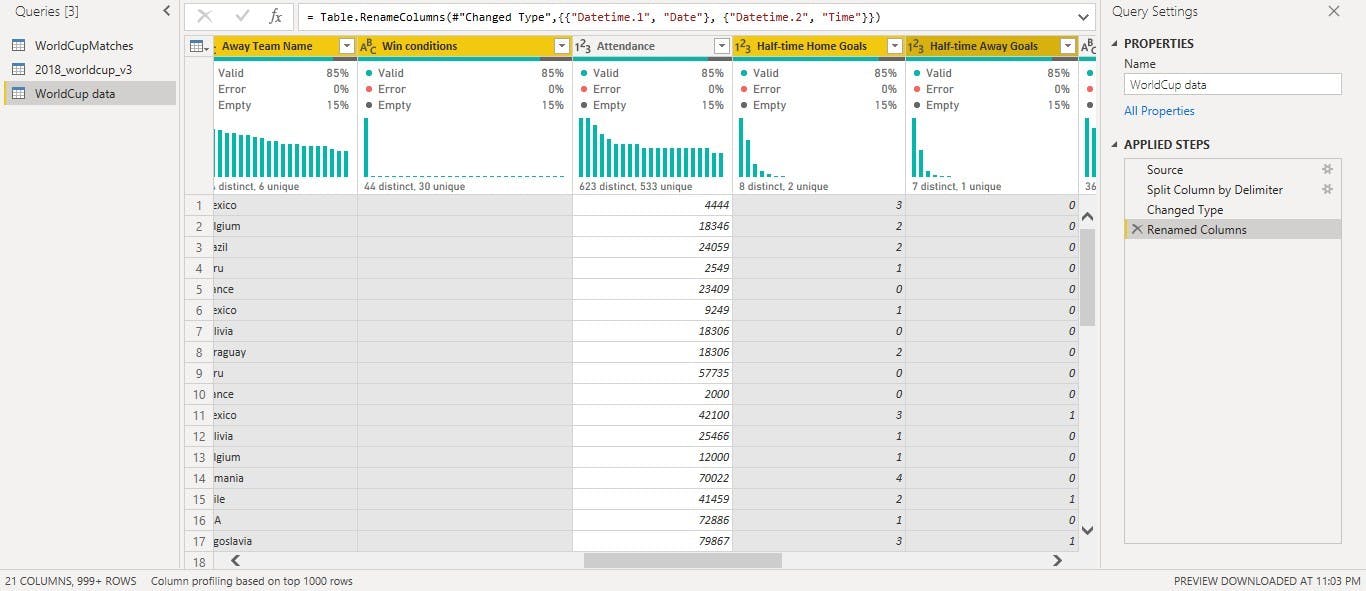
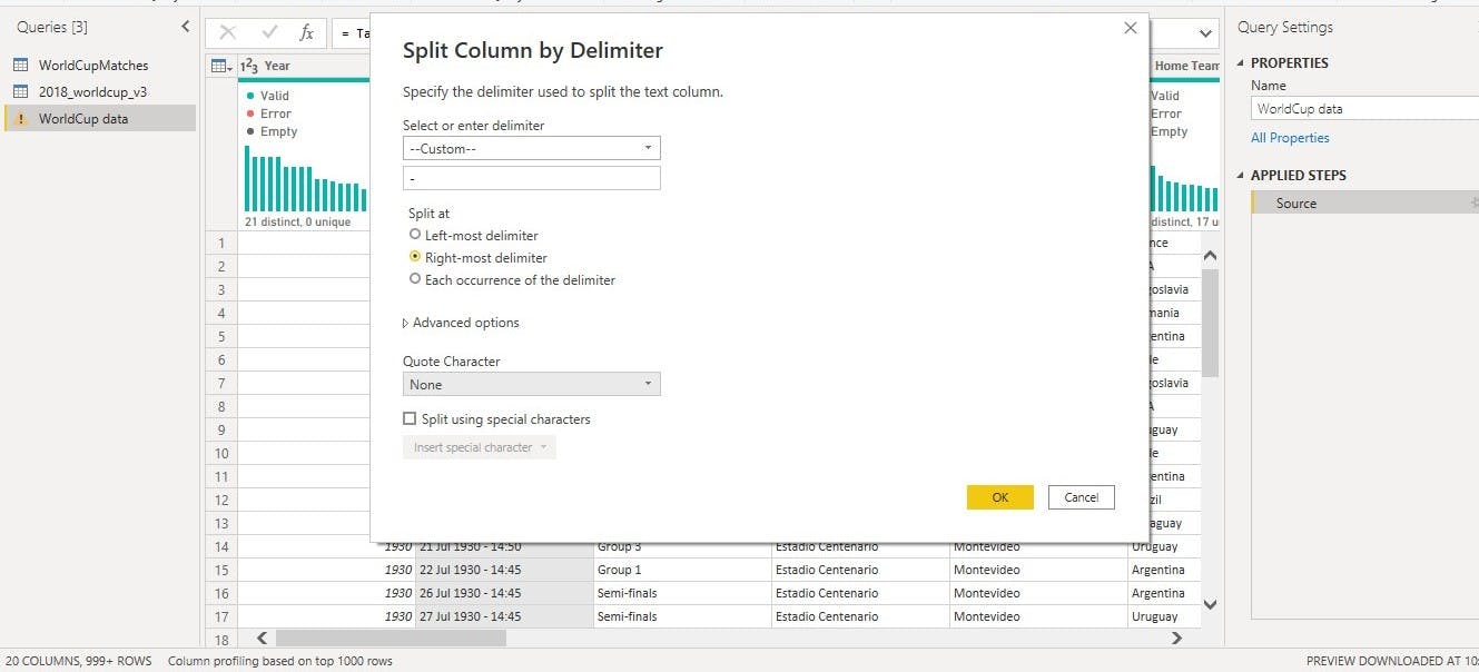
- the next thing we did was to split the Datetime column using the Split column function which helped split the Date and the Time into two different columns.
We used the Split by Delimiter where we specified how we want the column to be split.
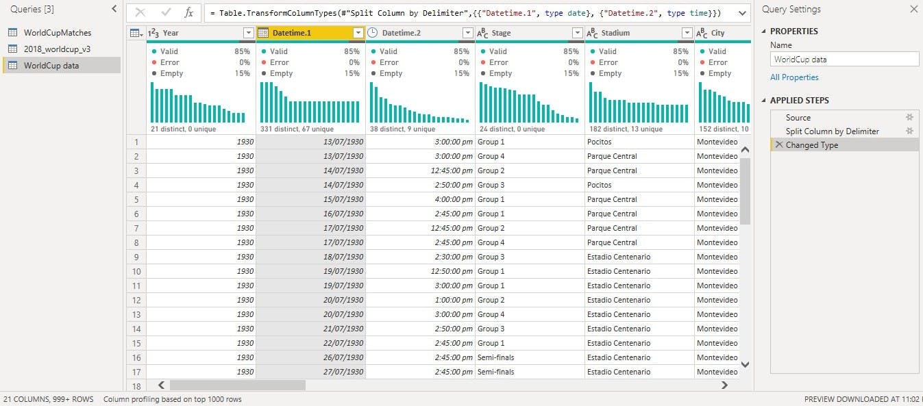
 Now we have the Date and Time in different columns. We then renamed the column appropriately.
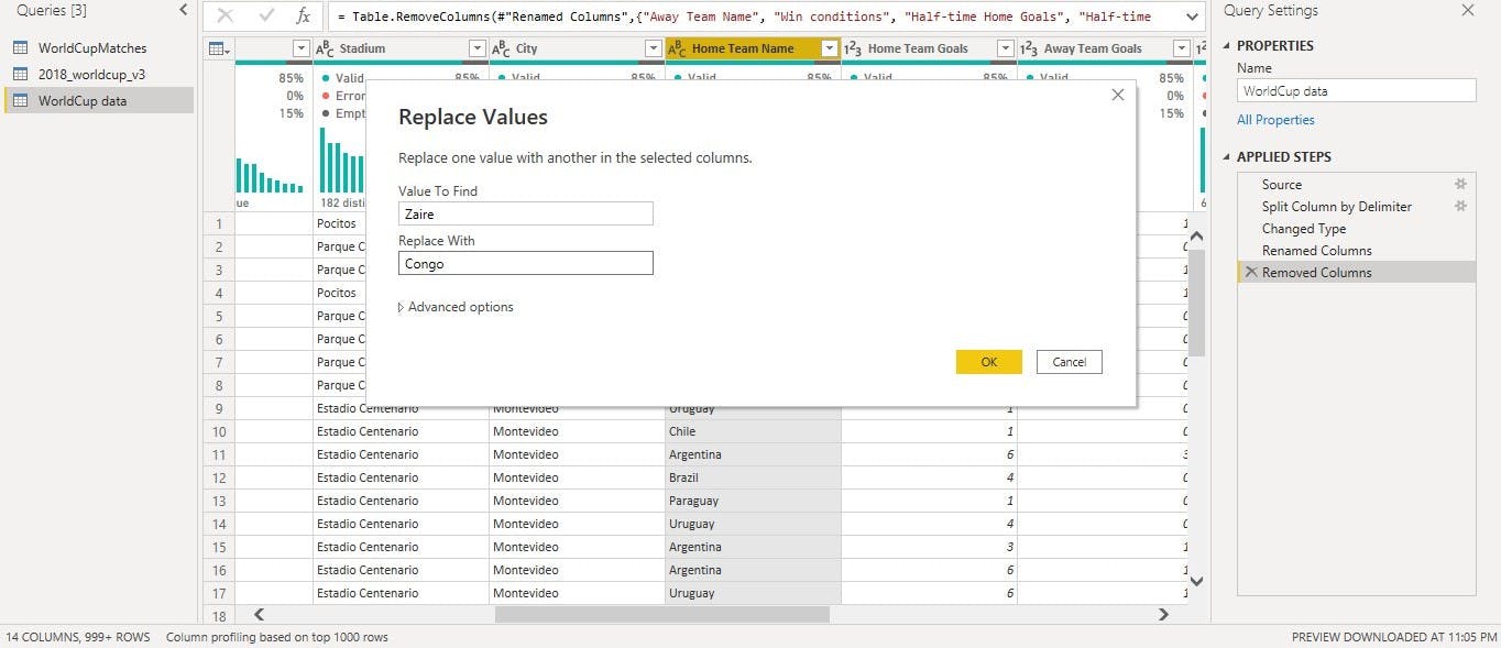
- some countries over the years have had their names changed and in order to have a unique dataset we had to change the names to the name they go by now. An example is Zaire which is now known as Congo. We changed this name by using the Replace value function. We simply right clicked on the column where we want to use the Replace value function, we then selected Replace value which popped up the Replace Value page as seen below.
- the next thing we did was to import the third dataset which contained the information of winner from 1930-2018. We simply used the Get data function to import the dataset into the Power Query Editor. In this dataset we also used the Replace Value function to update the names of some countries.
- after this we used the Close & Apply function in the Home Tab to load the data to Power BI for further Analysis and Visualization.
Data Visualization
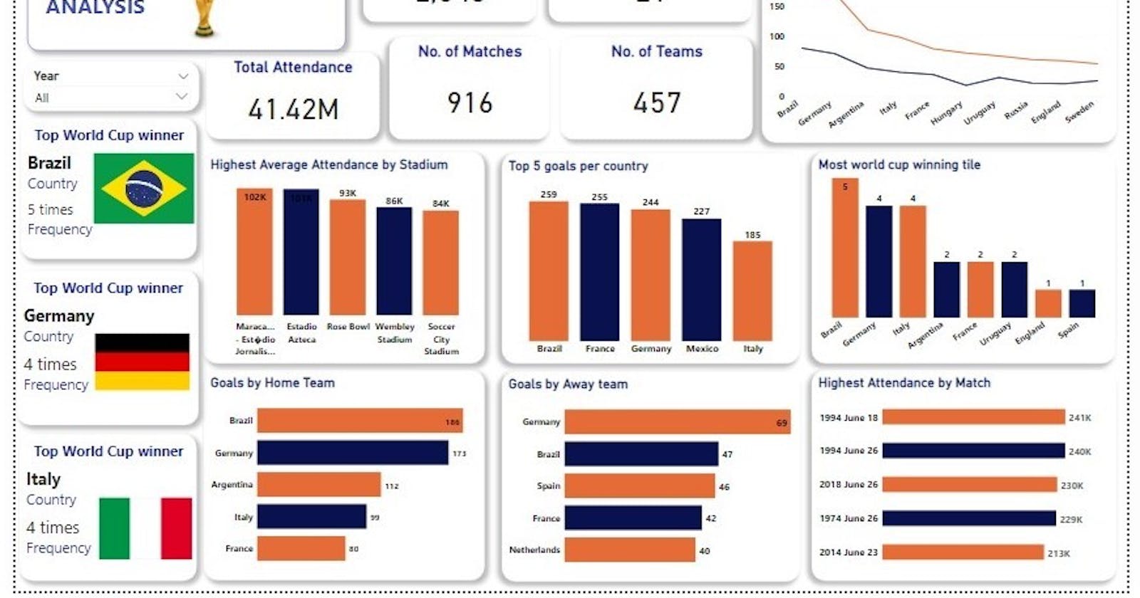
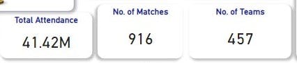
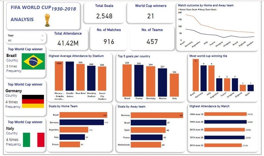
Now that we have a clean dataset we went ahead to visualize the data using charts thought appropriate. In the dashboard we create we used Card to visualize. Information like Total Attendance across all the World Cups, Total goals recorded, No of Matches played, Number of World Cup winners etc.
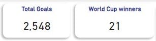
We used the line chart to visualize the match outcome of both Away and Home teams. In this we can easily tell the country with highest goal scored across the years. The year slicer can be applied to find out the match outcome per year.
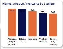
We then used the Stacked Column chart to visualize the Highest Average Attendance by Stadium where we can see the Stadium that had the highest attendance across the years. The year slicer can also be used to determine the stadium that had the highest attendance per year. The Visuals show that Maracanã stadium had the highest attendance.
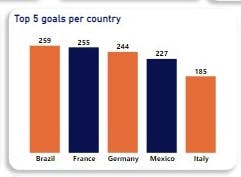
We then visualized the country with the highest goal scored over the using the Stacked Column Chart. The year slicer can be applied to find out the highest goal scored by countries per year. Brazil had the highest goals scored with a total of 259 goals.
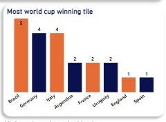
We visualized the country that had the most world cup winning title. Brazil has the highest winning title, they had won the title a total of 5 times.

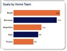
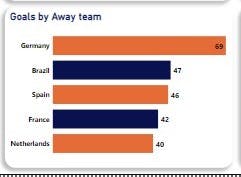
The number of goals scored by the Home and Away team were visualized separately using the Stacked Bar Chart. The year slicer can be used to determine how these teams performed over the years.
Having done this we visualized the Highest attendance by match using the Stacked Bar chart as well.
Conclusion The different charts we used can be referred to as Tiles, a combination of these Tiles on the Power BI Canvass is known as the dashboard. The dashboard we created is shown below:
You can further interact with the dashboard hosted on the Power BI service Here.
In case you missed our last two publications you can readthrough them here Week 1, Week 2.
Corrections and contributions are welcomed.
Thank you.